A little while ago I was tasked with completing a product design challenge for GM. I decided to document the work that I did for this 5-day assignment. The challenge was laid out as follows:
For this creative exercise, take an empathetic look at the driving experience. Your goal is to identify and define a user problem and create a cohesive, cross-platform proposal that you will present and defend to our interview team. Consider the following touchpoints in your solution: in-vehicle displays and controls, mobile applications, voice interactions and IOT.
While researching for problems to identify, I came across many interesting innovations that were in-development or already in use. Rather than attempt to make an incremental improvement to an existing solution or propose something out of science-fiction, I decided to focus on a real-world, existing problem for GM customers.
For the purpose of this case study, I focused on the myGMC app, utilizing publicly available app review data. I assumed similar findings for both myBuick and myChevrolet since both the offerings and features with each app are nearly identical. I used a tool called AppBot to analyze user reviews and cross-reference with their individual ratings, sentiments, and discussion topics.
A common complaint
As I thumbed through reviews for myGMC a consistent pain-point became apparent in 1-to-2 star reviews - OnStar pricing. Users were frequently upset at either the price to utilize Remote access features, or the fact that after years of being a loyal customer, they were now seeing these features disabled. From a small focus group of friends who owned GMC vehicles, I discovered that this was also a personal paint-point for them.
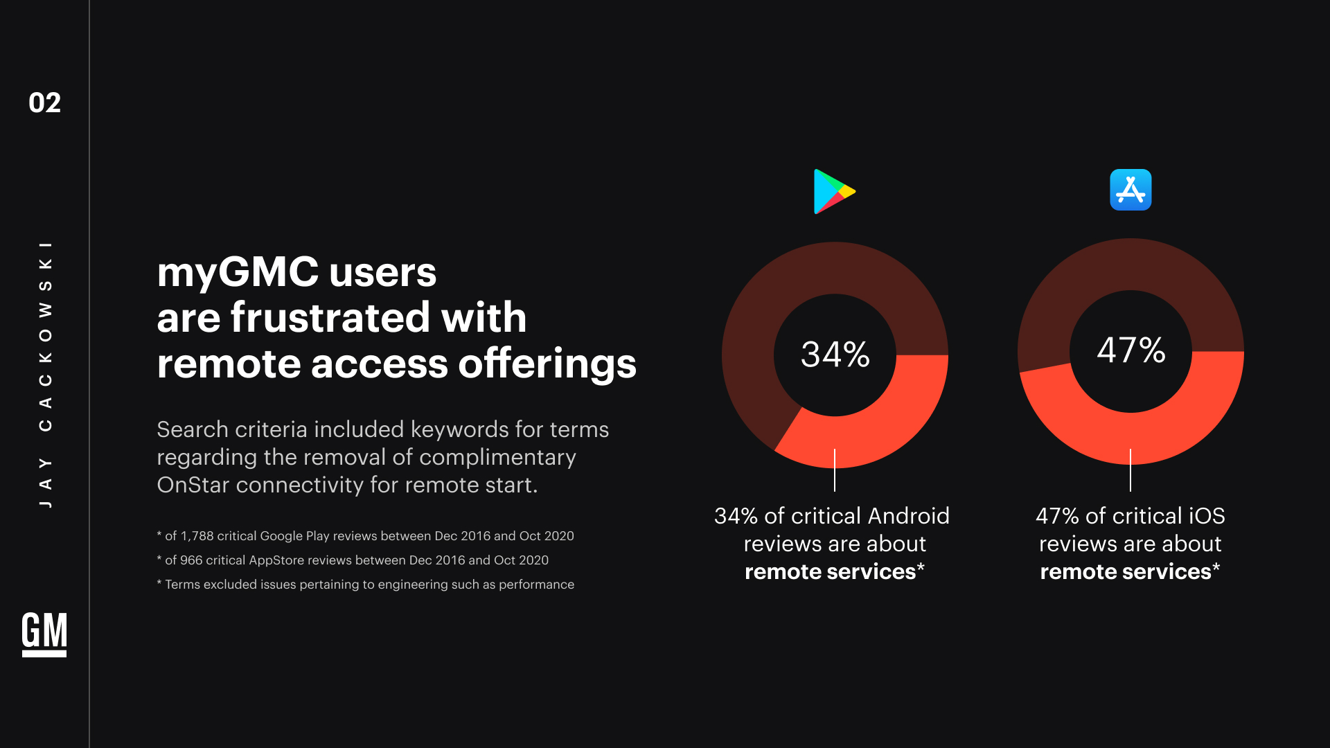
To get more accurate numbers, I scanned for specific keywords relating to remote access features being removed in conjunction with dissatisfaction with pricing. This research was focused on critical reviews from December 2016 to present, meaning reviews that had a neutral, negative, or mixed sentiment, but could also include reviews with more than 2 stars.
I also excluded reviews that had to do with bugs or app performance, which I think are more so engineering issues (of which is probably the most criticized issue category).
Bait and switched
No one likes an extra fee tacked on. GMC customers feel shafted, or nickel-and-dimed, because they’ve been used to having a generous complementary subscription period that’s been diminished repeatedly over the years - now down to a mere 30 day trial.
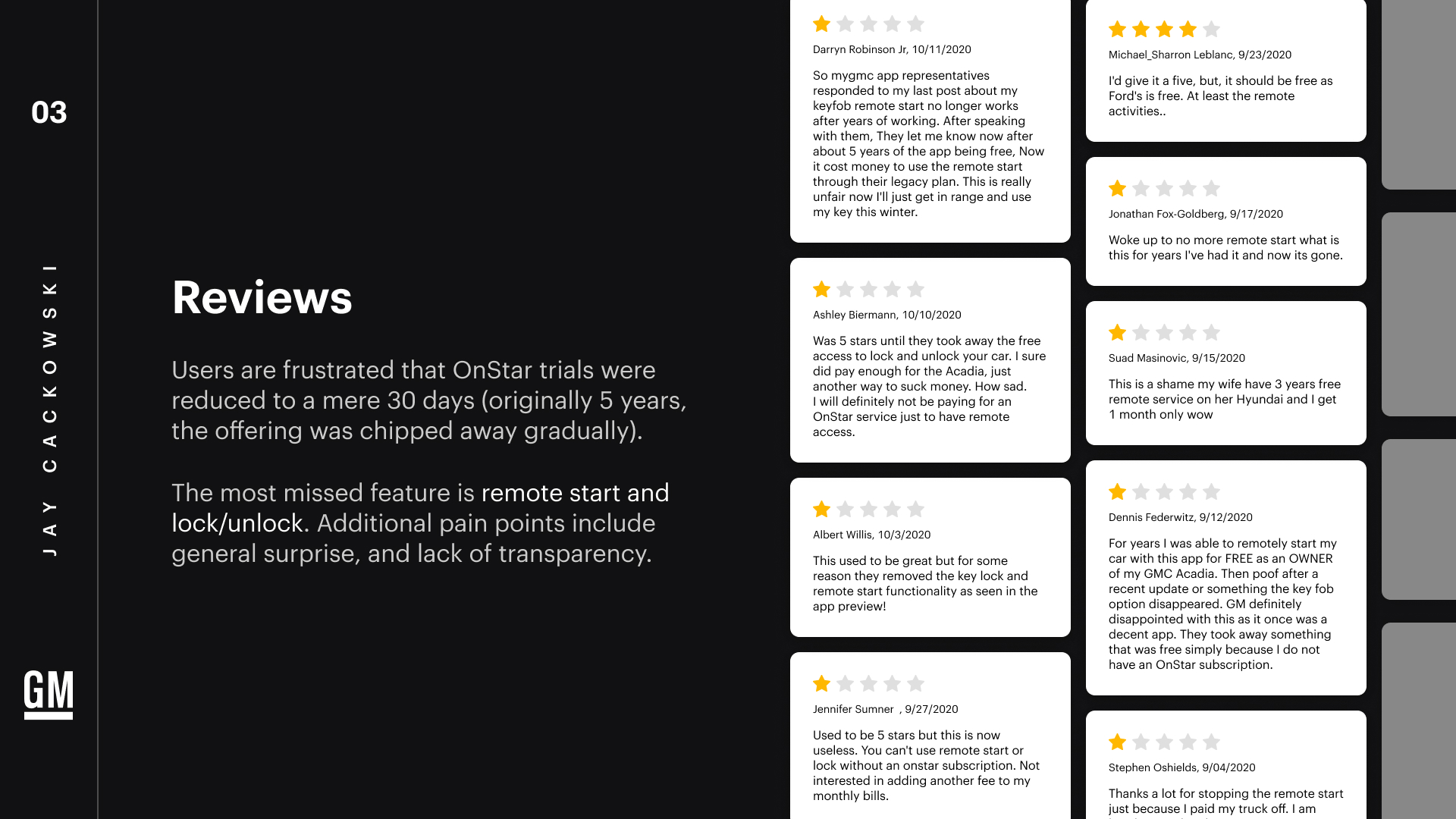
Literature and opinion surrounding this change cover the decrease over the years, and note that a 30 day trial is hardly enough time for a user to become acquainted with all the ins-and-outs of their vehicle.
New users feel bait-and-switched, or are quick to point out that competitor offerings are superior
Of these critical reviews, the most missed features were remote start and locking. Folks were also generally upset at the sudden change in pricing, often noting there wasn’t adequate notification, or none at all. A missed opportunity in onboarding.
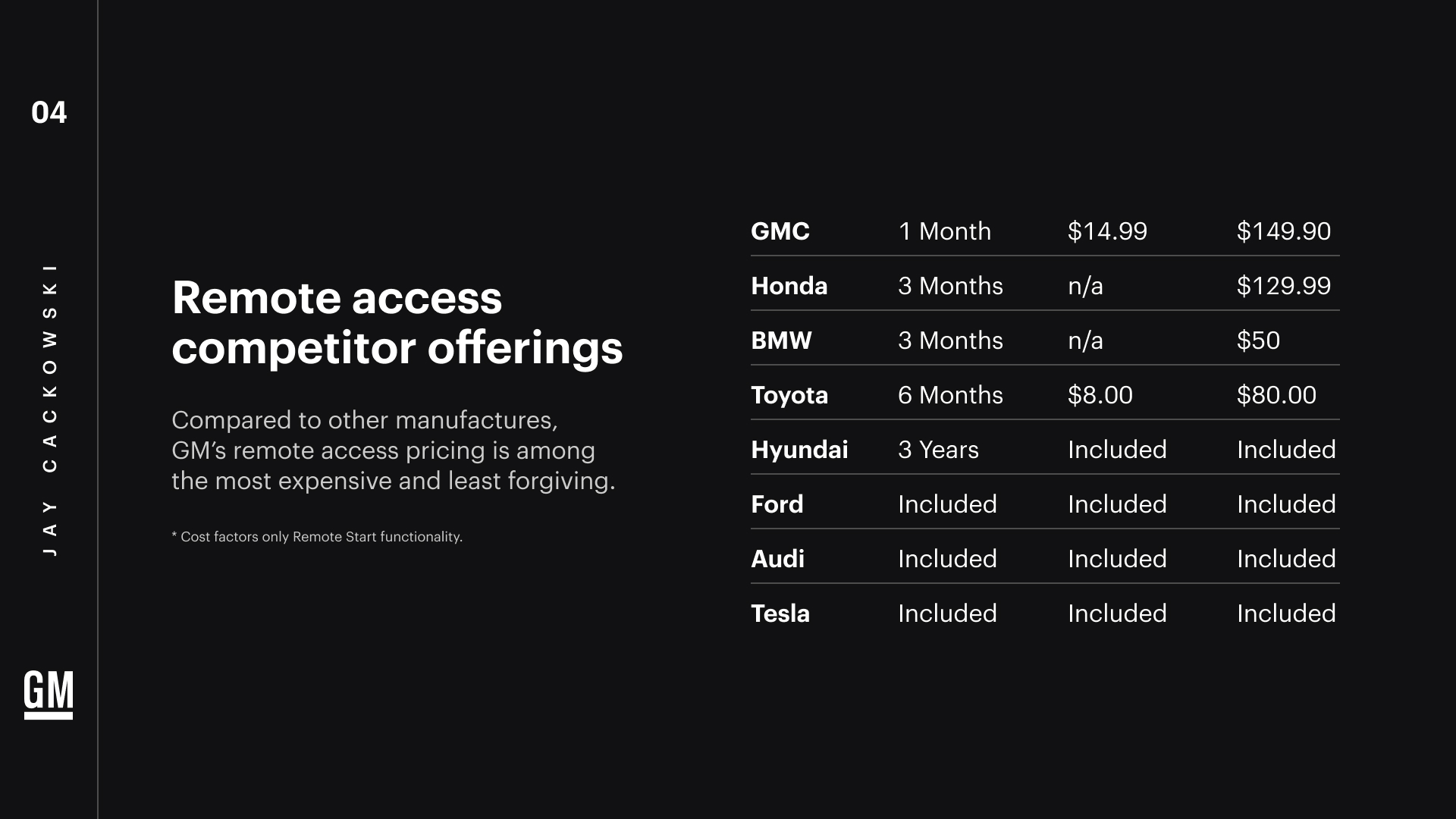
Compared to other manufacturers, GM’s pricing for remote access features is among the most expensive and least forgiving in terms of the trial period.
The general trend among manufacturers today seems to be shifting remote access costs into the vehicle price so that trials can be extended and subscription prices can be reduced or outright eliminated by including them with your purchase.
Retention as the goal
I identified the goal of increasing OnStar retention because we essentially want users to continue to pay for OnStar or see enough value in it to subscribe if they’re a lobby user, or resubscribe if they’re a lapsed user.
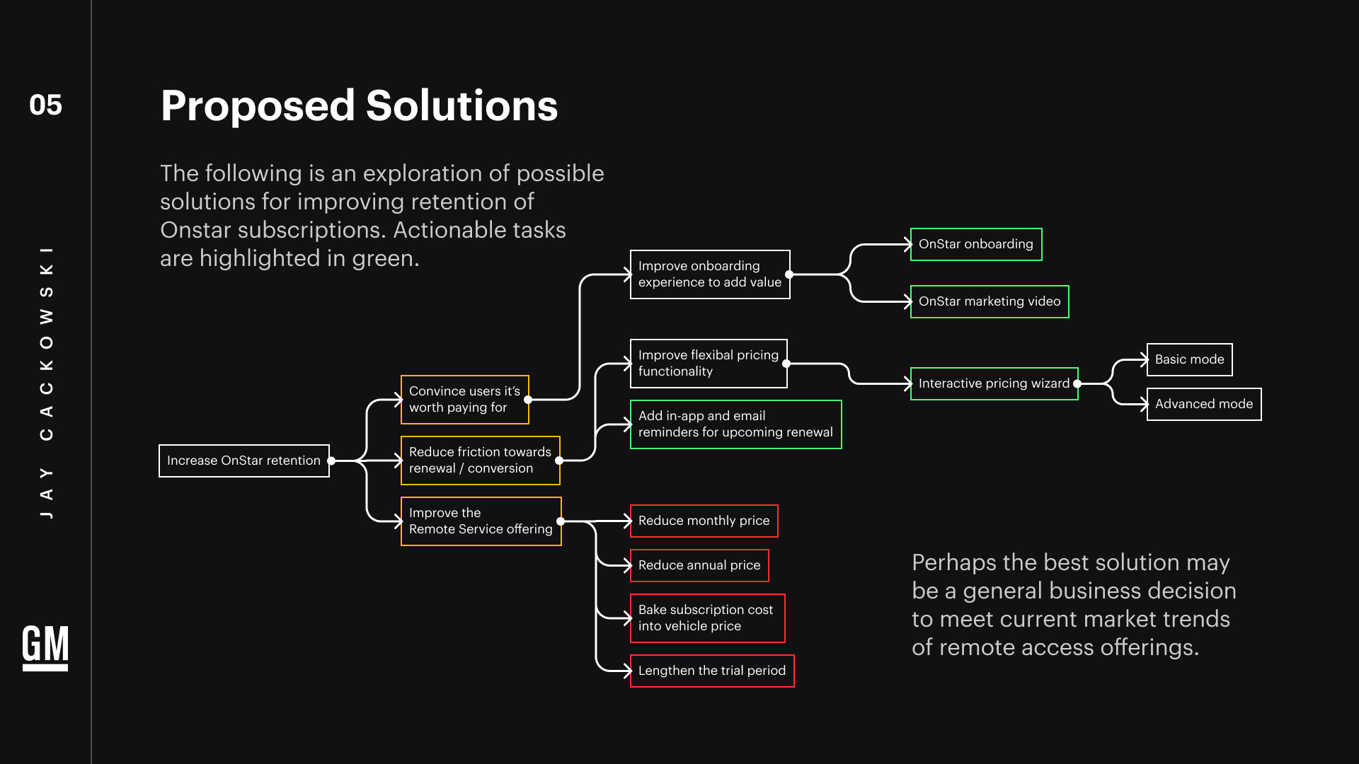
To accomplish this, I identified actionable tasks through a solution tree. You can see my thought process outlined in this flow-chart. Since we likely wouldn’t be able to improve the remote service offering, and it isn’t exactly a PD challenge, I focused on the other two goals of:
- Reduce friction towards renewal or conversion
- Convince users that OnStar is worth paying for
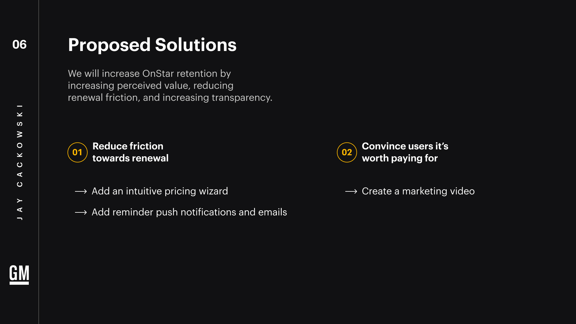
Our first goal is to reduce friction towards renewal. I must admit that I wasn’t sure about the specifics behind the live experience in the “Manage Data Plan” option because I wasn’t able to access that in my research - but for this exercise I assumed that it’s fairly basic or links to an external site.
I believed that an in-app pricing wizard would be a much better experience in terms of granting the user better control over their own subscription, and more transparent in terms of the remote access features from OnStar.
I wanted to reinforce this transparency with good push notifications and emails that keep the user in the loop, and the OnStar value top-of-mind.
Finally I proposed a marketing video or content campaign that highlights the overall benefits of an OnStar subscription (remote access, security, infotainment), as well as highlight new in-app features for the user to control their own pricing.
Solution 1: In-app pricing wizard
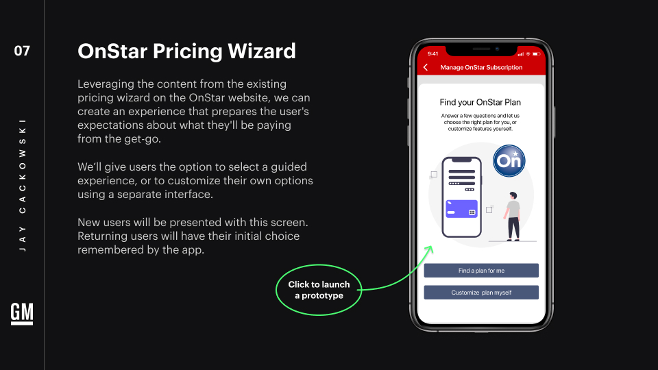
From the home screen, we’d navigate to “Manage Data Plan”. I suggested that we change the wording of this so that it’s more descriptive and transparent, so I used “Manage OnStar Subscription”. Click the image below to launch a prototype in Figma.
We’ll present users with an initial screen where they can choose between the basic wizard, or the advanced customization interface. The app will remember their choice from this point on, so they don’t need to see this screen again - although they’ll have the option to toggle back and forth after the fact. For the guided experience, users can first select “Find a plan for me.”
Once in the wizard, we’ll ask the same tree of questions that’s on the OnStar website pricing wizard, which can be found when a user clicks “Find Your Plan”. These questions help narrow down the pricing package based on the user’s preferences for features that they want. We’ll add visual interest with unique illustrations on each question to keep the user engaged. For the interface, I used simple, large buttons close to the thumb to prevent slipping.
At the end of the wizard, we’ll display the chosen package based on the user’s answers, along with the new subscription price. Upon clicking the CTA, the user will be presented with a confirmation window that informs them of the change that will occur to their existing plan if applicable, as well as the date that their plan will change.
We’ll send them a confirmation email with more detailed information that reiterates the change, so they have that information on record. Depending on how OnStar billing operates, we might want to limit the ability to change a plan frequently, or present an alert message to avoid any mistakes or billing complications.
Solution 1: Granular pricing control
If you’re still in the prototype, you can click “Manage OnStar Subscription” at the top to go back to the main page. Now we’ll choose “Customize Plan Myself.” In this interface, we are represented with granular control over each paid OnStar feature. You may notice that we are re-using the UI component from the infotainment addons.
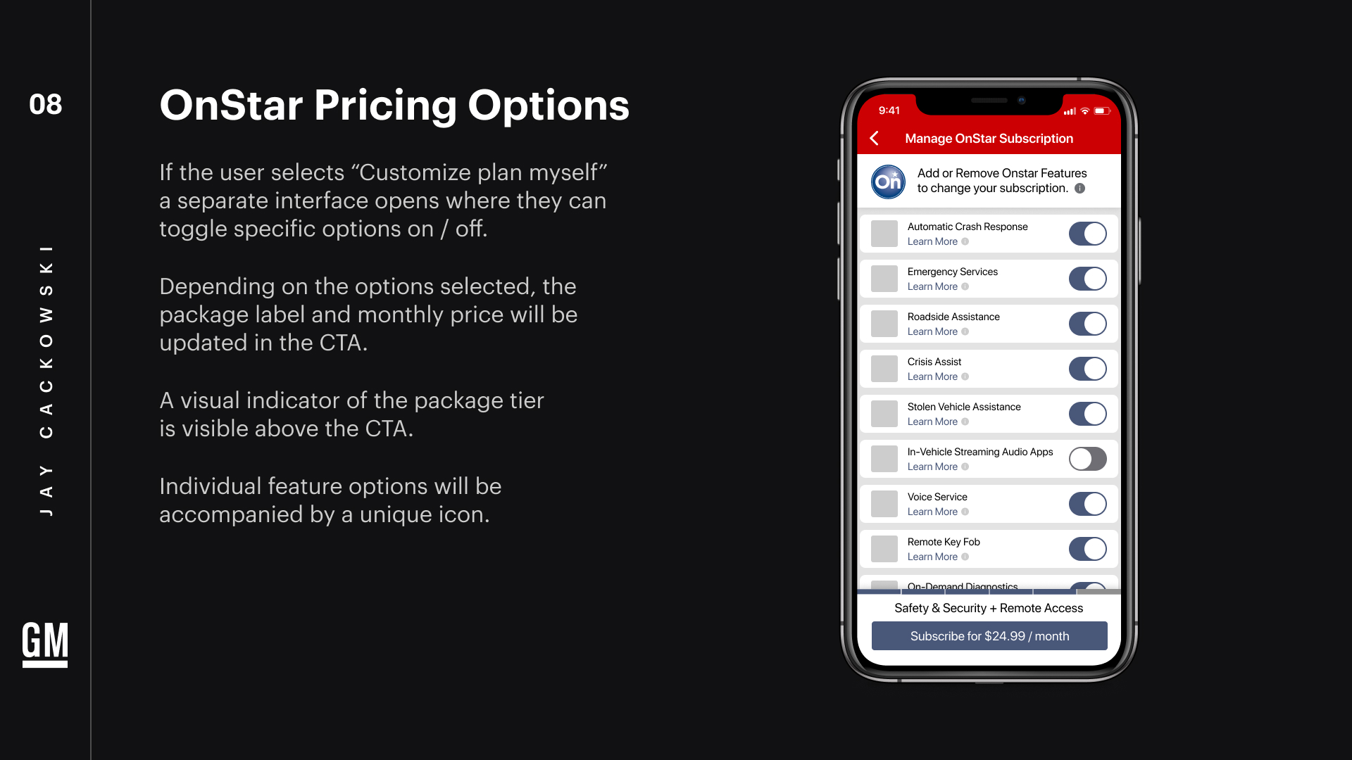
Based on the options selected, the package name and monthly price will be updated in the fixed footer and in the CTA. We can add a visual indicator that shows the package tier being selected. This indicator could potentially be explored to be more interactive so that a simple option is still available in this “advanced” customizer.
As users toggle on and off certain features, some features may automatically enable or disable themselves because they are tied to a specific grouping of features that can’t be changed.
We’ll add some visual appeal by adding a unique designed icon next to each feature.
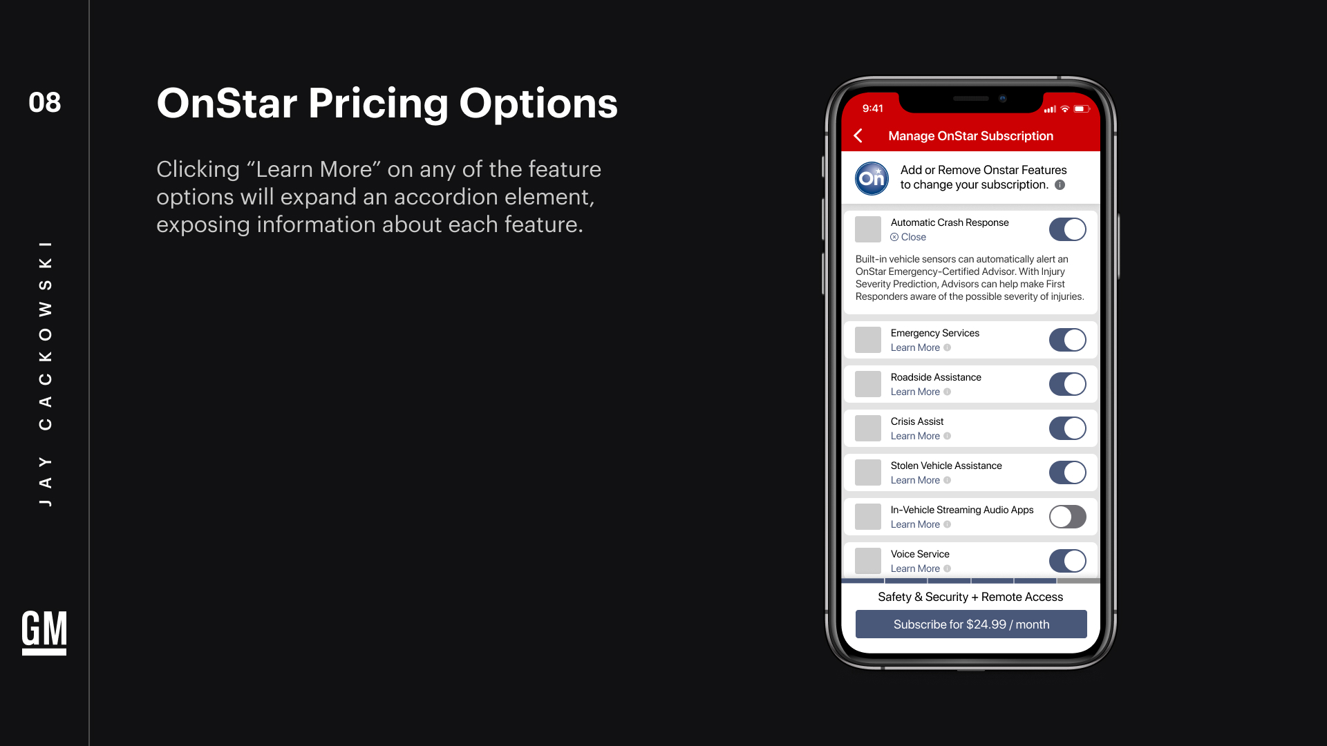
If the user wants to learn more about a specific feature, we’ll give them the option to read about it by clicking “Learn More” which will expand an accordion element on each feature component, which helps the user make a decision.
On check-out, we’ll utilize the same interface and policy that we did for the pricing wizard. Additionally we may want to show a confirmation screen or user profile page that shows the final changes and next renewal date.
Solution 2: Push + email notifications
We want to keep the value of the OnStar subscription top of mind. If we’re not already, let’s utilize push notifications and email reminders about upcoming renewal. We should use creative messaging that reinforces the value of remote services. In this example, we remind Jim that his subscription is still active, and that his vehicle is protected, giving him peace of mind.
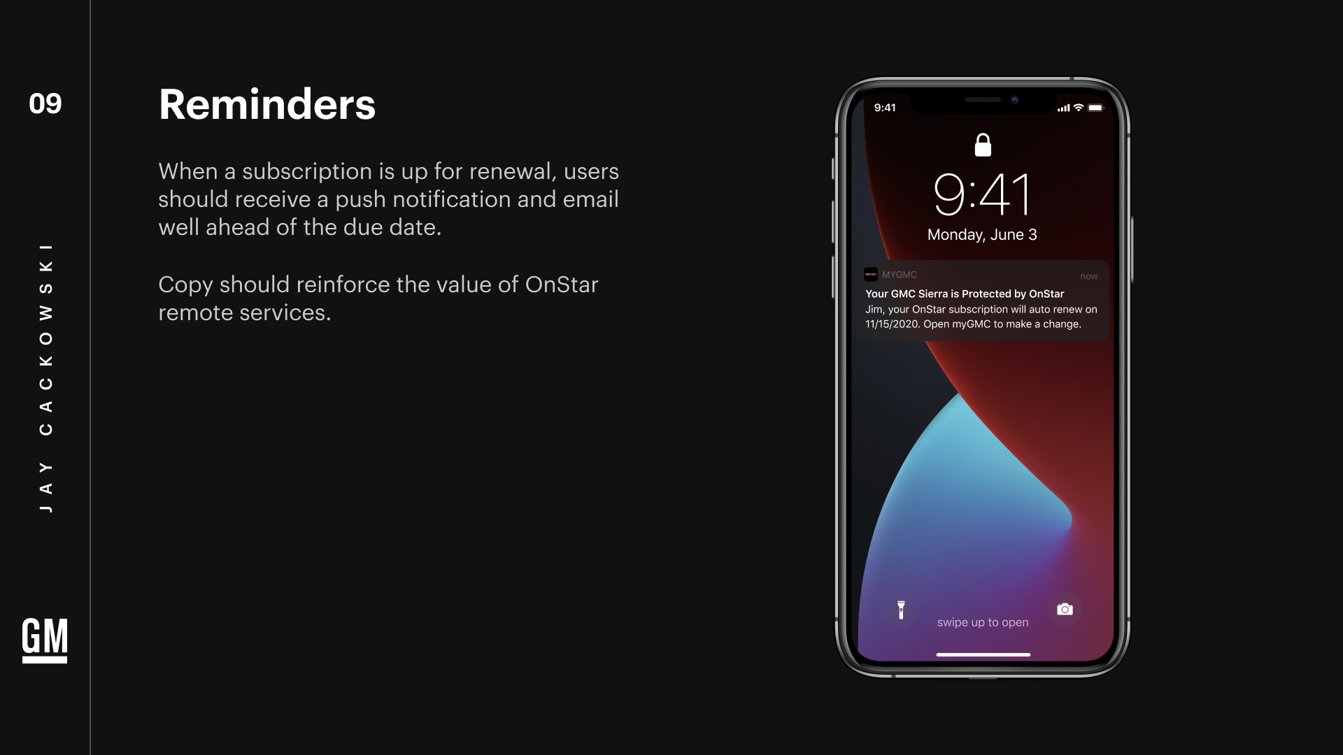
Certainly we’d want to allow the user to be able to toggle these notifications off if they so choose. Hopefully at that point they’re sentiment has become positive.
Solution 3: Parallel marketing campaign
The current OnStar offering puts us in a tough bind. Let’s create messaging around the benefits of OnStar to offset negative perceptions around it. This could be done through social media content like a branded video.
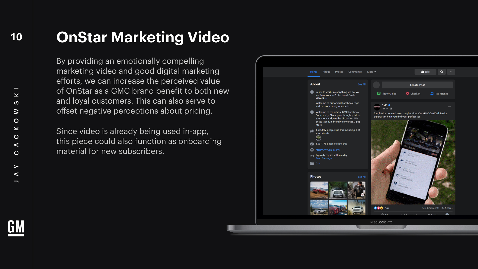
Marketing may also help dispel the general misconception that users are paying for the myGMC app instead of an actual wi-fi hotspot in their car, which is basically a separate cell-phone service - customer education being the key point here.
Other marketing efforts may include newsletters showcasing benefits, or users stories where OnStar and remote access features have helped out or been a benefit to customers.
Increasing OnStar Retention
Exploring ways to solve a consistent pain point in myGMC, myChevrolet, and myBuick consumer apps. Part of a GM product design challenge.
