At Mango Languages, I've helped mature and evolve the presentation of a fresh rebrand across digital and physical mediums. Working collaboratively across departments, our creative team developed compelling marketing visuals and vehicles for learning material.
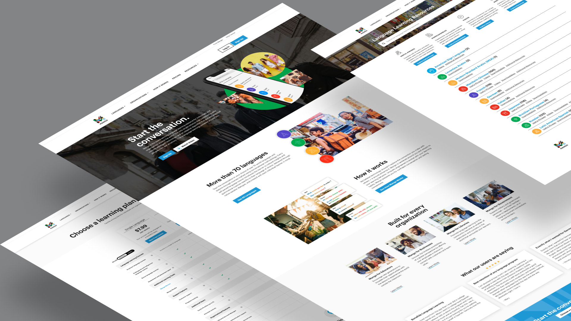
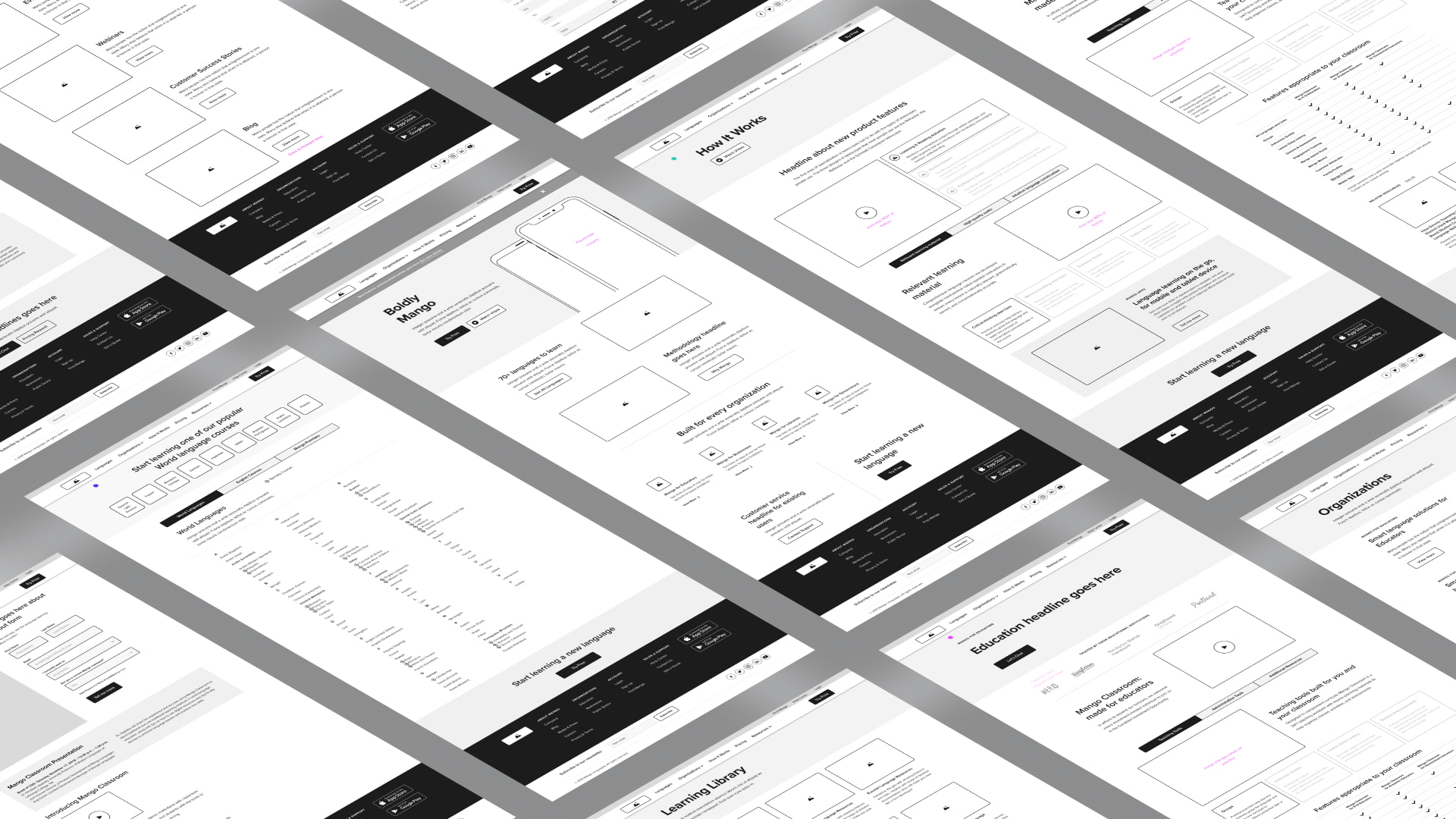
The Mango website was designed to speak to a B2B audience (schools, businesses, and government entities) while accommodating a B2C narrative and user pathway for individual learners. Working from existing IA and wireframes (Meng Yang), I breathed life into the visual design of the website based on the newly prescribed brand guidelines.
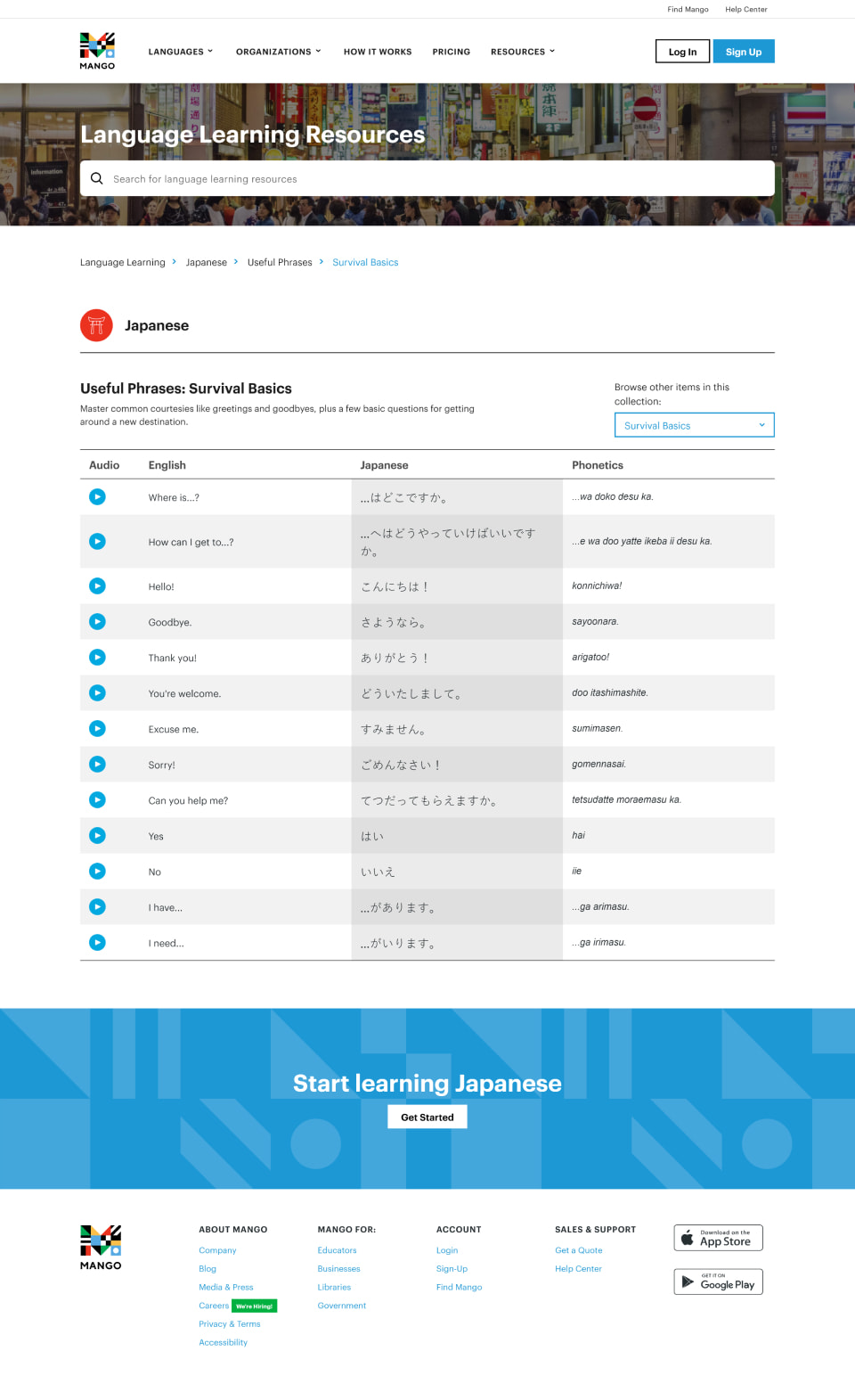
Working across departments, I designed a large resource section of the website containing free learning content for our top 10 languages. Organized with taxonomies, the "LLR" section provides un-gated access to educational videos, lesson plans, and interactive sets of useful phrases.

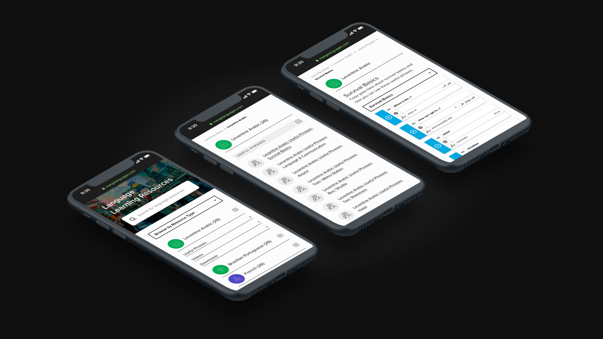
The Language Learning Resources content provides a glimpse into the quality of Mango's in-app learning material. We designed these resources to be practical on for the user on mobile, with easy-to-use playback controls, and searchable content via auto-suggestion.
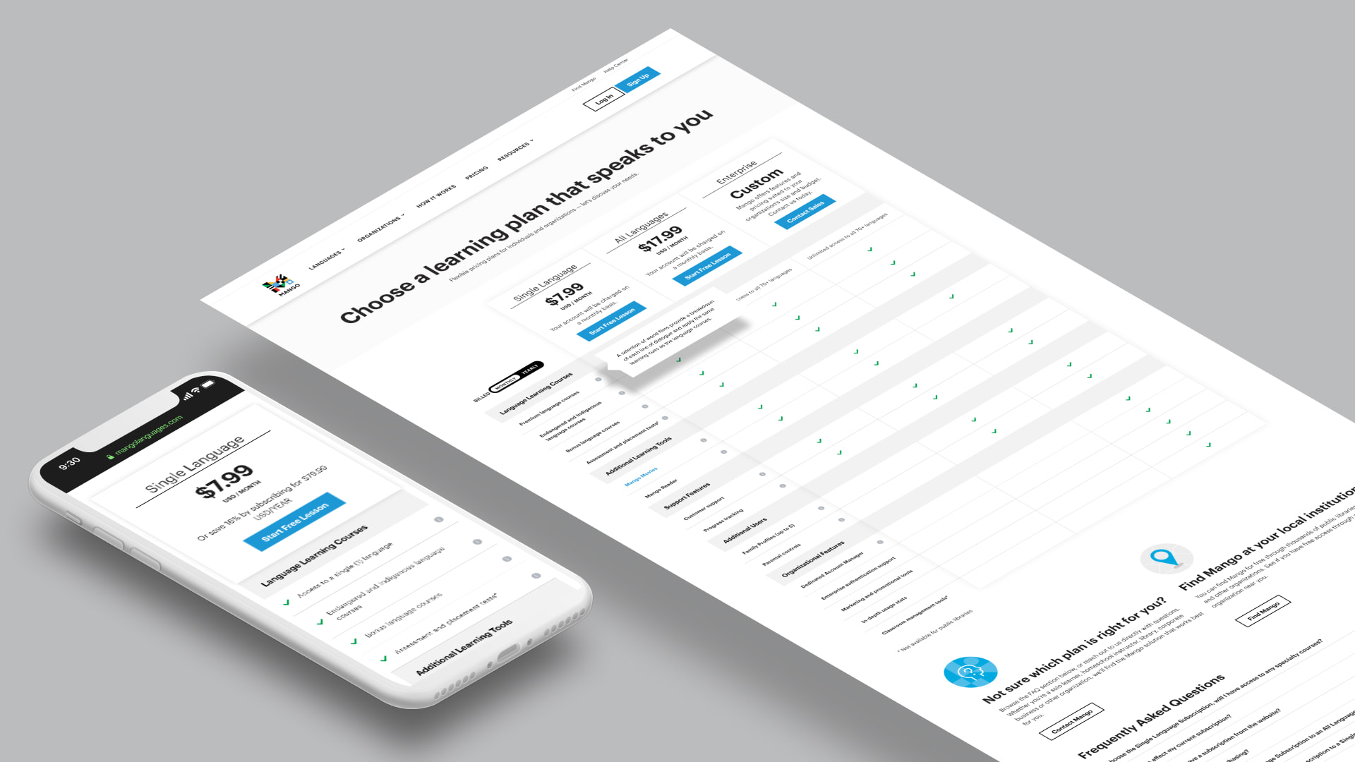
Working with the customer service team at Mango, I designed a more robust pricing page to alleviate many commonly asked questions by prospective buyers. Among features added were informative tooltips, and an interactive toggle that switched between yearly and monthly pricing.
Various visual components used to represent different aspects of the Mango product ecosystem. Mango Admin Portal pictured.
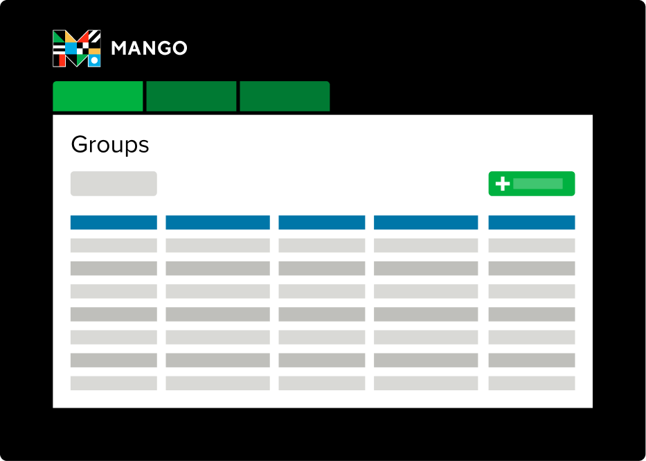
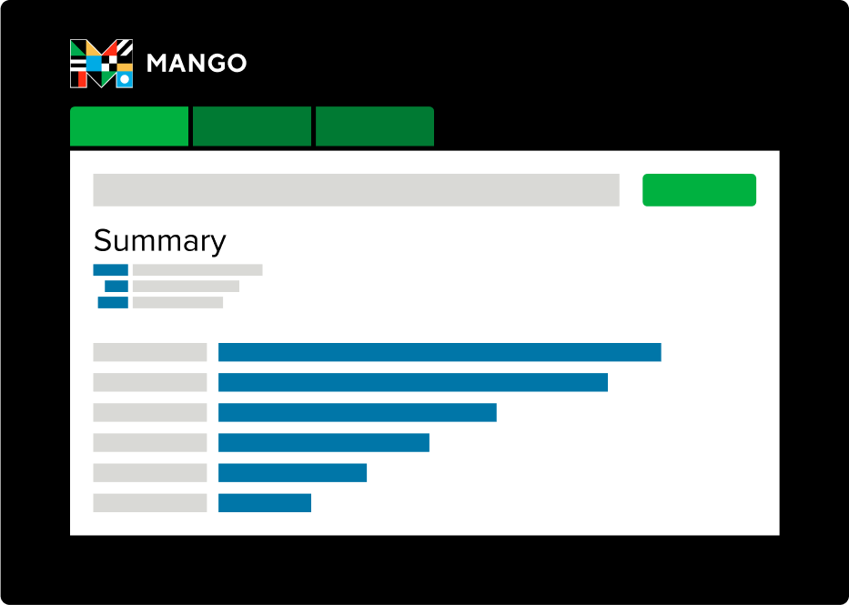
Visual components meant to address different B2B verticals such as public library, K-12, corporate, and government.

Cover photo concepts for Facebook and Twitter. These designs were meant to reflect Mango's international narrative with an approachable, human feel.

In representing a new brand narrative for 2020 and beyond, I designed a typographic lockup with a contrasting feel from our existing material. The phrase is meant to be paired with evocative, wordly photography meant to spark a sense of curiosity and adventure.